Saas Dashboard
Figma / Jira / Unsplash
Lead Product Designer
1. Joel Antwi - Lead Designer Matt Jewitt - Junior Designer Ben Schofield - PM
Figma
4 Months
Project
Overview
The goal of this project is to redesign the current dashboard to improve usability and responsiveness for a diverse range of customers in the sports coordination sector.
Step 1
Highlights
This initiative is part of a comprehensive strategic design blueprint focused on elevating the user experience, creating a seamless and consistent interface, and actively promoting customer engagement.
Step 2
The Challenge
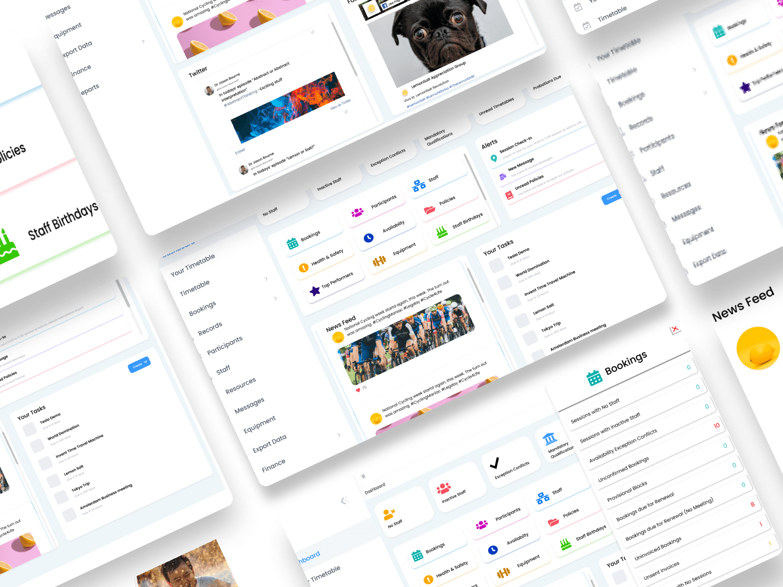
The current dashboard is overcrowded with more than 17 widget tables, many of which are automatically disabled depending on the user's permission level and customer type. To better serve the diverse needs of Coordinate Sport's users, the UI and UX require a complete redesign to make them more dynamic and responsive.
Step 3
Hypothesis
If we redesign the Coordinate Sport dashboard to be more modular and responsive for different user permission levels, users will find it easier to navigate and interact with the platform. This redesign will simplify the cluttered widget tables into smaller, customizable widgets, improve mobile usability, and use consistent colors for better visual appeal. As a result, we expect these changes will increase user satisfaction, boost engagement, and make the dashboard's features more effective, leading to higher retention rates and positive feedback from various users.

Step 4
Research and Analysis
1. Keen Themes Exploration: I analysed the Keen themes 8 theme file to understand existing UI elements and colour schemes. This helped ensure the new design maintained visual consistency with the broader application.
2. Permission Level Assessment: I logged into various user roles—administrators, team leaders, and standard users—to document the minimum default widgets available. This analysis highlighted the essential features for different permission levels, allowing for a more tailored user experience.
3. Competitor Analysis: I examined dashboards of competitor platforms like Monday.com and other booking SaaS companies. This comparative analysis revealed successful design elements and industry trends that informed our redesign strategy.
4. User Feedback Gathering: I collected feedback from current users through informal interviews and surveys. Insights on pain points and desired features, particularly regarding clutter and navigation difficulties, provided valuable context for the redesign.
5. Synthesis of Findings: I synthesized all findings into actionable insights, creating user personas, mapping user journeys, and prioritizing features for the redesign. This ensured the new dashboard design was data-driven and aligned with user needs.

Step 5
Userflow
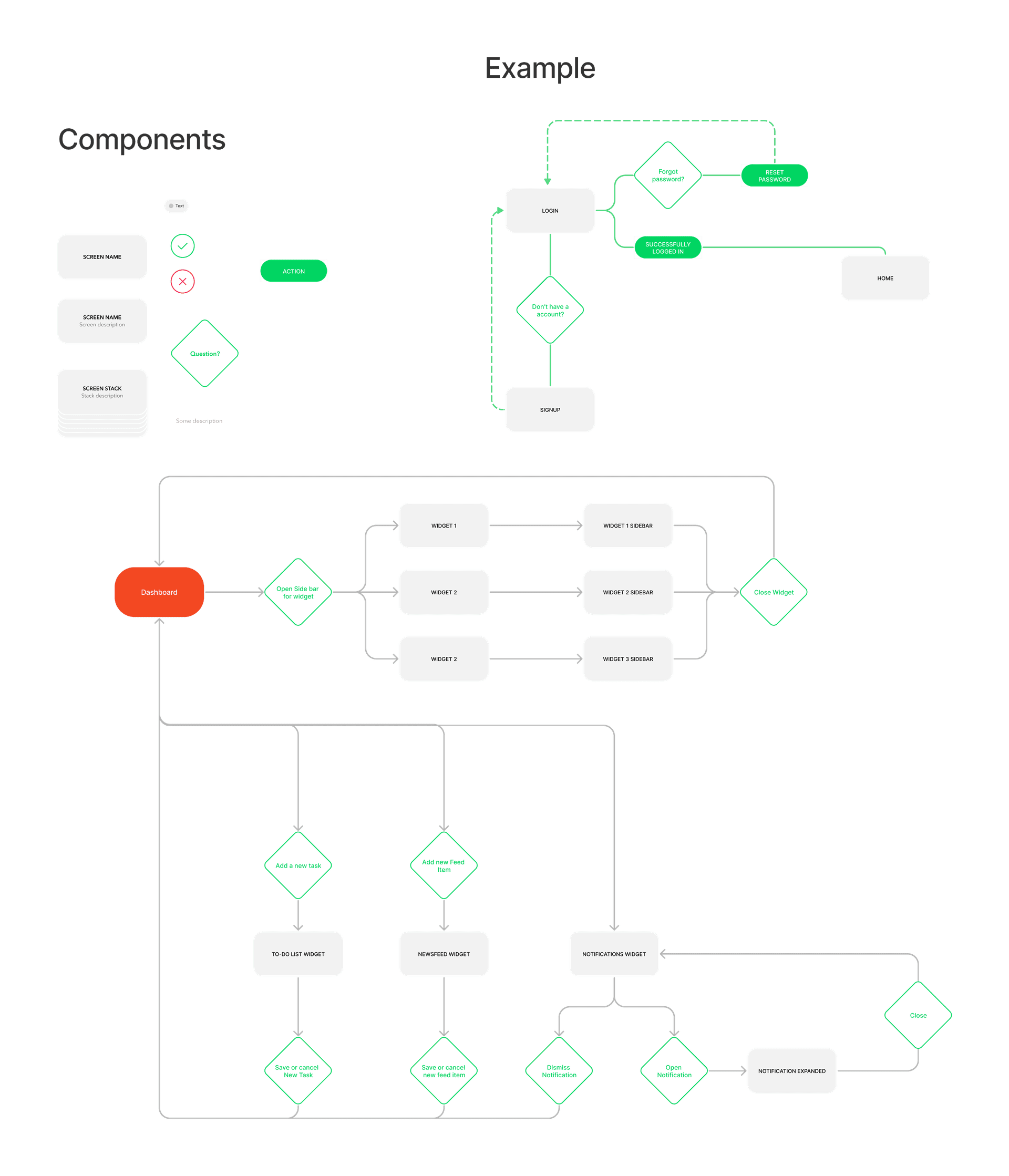
To improve the UX/userflow of the dashboard, I decided to condense all of the tables into smaller widgets. This made the design more modular, allowing for many different configurations and high customizability without breaking the user flow
Step 6
Wireframing
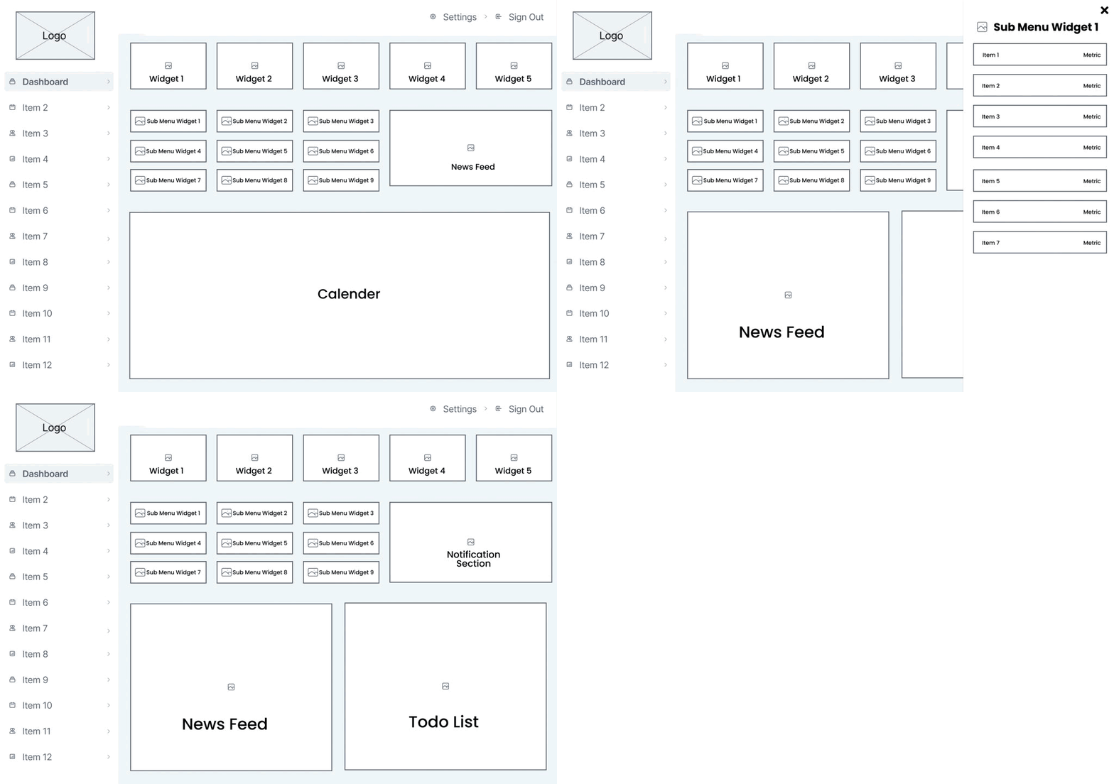
I used Figma to create my low-fidelity wireframes because it is a versatile tool that allowed me to easily experiment with different dashboard configurations and assess their impact on the design. I also made the dashboard more mobile-friendly and quicker to navigate by opting for slide-out bar Instead of popups, because popups can block the user's view of the dashboard and can be difficult to close on mobile
Step 7
Executing my plan
I first created a design library in Figma for this project, I followed a structured approach rooted in user-centric design. I began by analyzing the existing dashboard, which was cluttered with over 17 widgets, many of which were automatically disabled based on user permissions. I streamlined this by designing a modular system with customizable widgets tailored to different user types, such as administrators and standard users. Drawing from competitor analysis of platforms like Monday.com and applying insights from Keen themes, I designed a more visually cohesive and responsive UI, focusing on mobile usability. Each widget—such as the to-do list and news feed—was redesigned with intuitive features like expandable views and easy task management. By prototyping these elements in Figma, I iterated on the design to ensure it reduced clutter, improved navigation speed, and maintained visual consistency, all while increasing user satisfaction and adaptability across different devices.
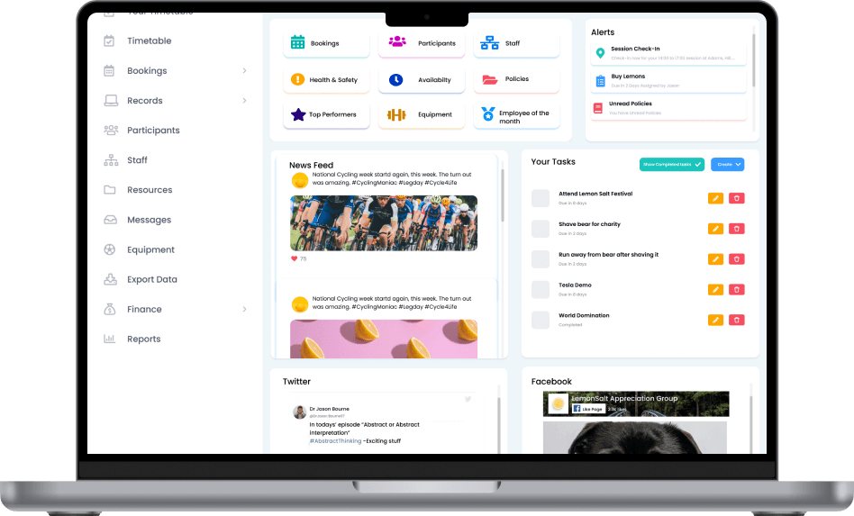
Dashboard View for Various User Types:
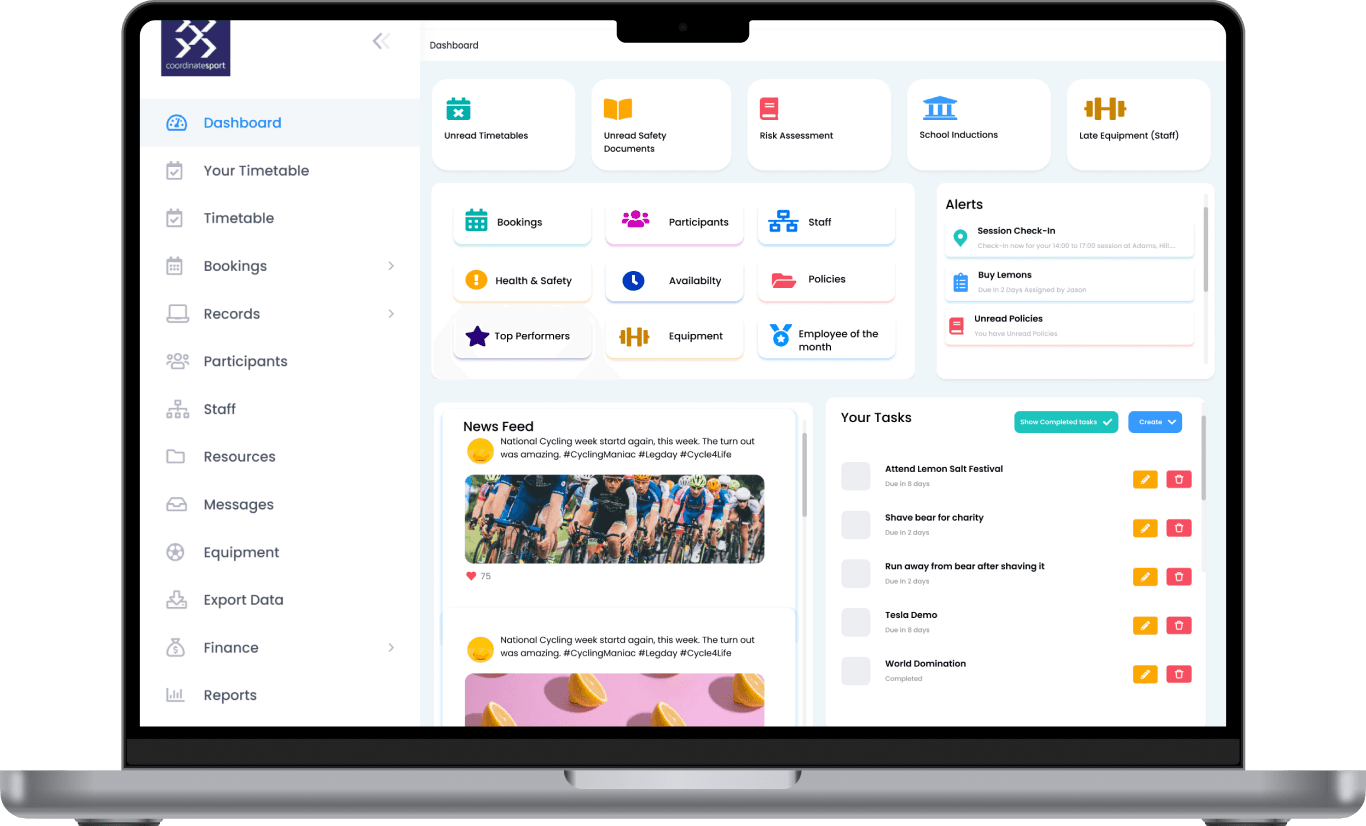
The dashboard displayed here is designed specifically for super users. A key feature of this modular dashboard is its customization for various business users, with widget and container sizes adjusting based on the user type.
This personalization enables each user to concentrate on the information most relevant to their roles and responsibilities, minimizing clutter and enhancing overall navigation.

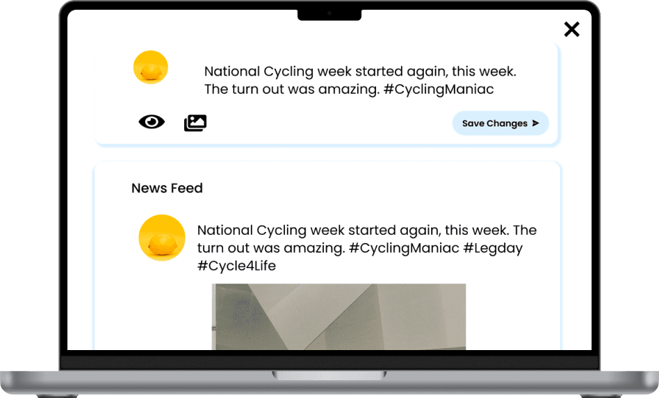
News Feed widget:
The new news feed widget represents a substantial upgrade from its predecessor. It boasts a more visually appealing design, enhanced navigation, and several exciting new features.
One standout addition is the option to expand the news feed widget for more in-depth information on each news item. Users can easily do this by clicking on the item's title or image. The expanded view reveals the full text of the article, along with any related images or videos, providing a richer experience.
To-do List widget:
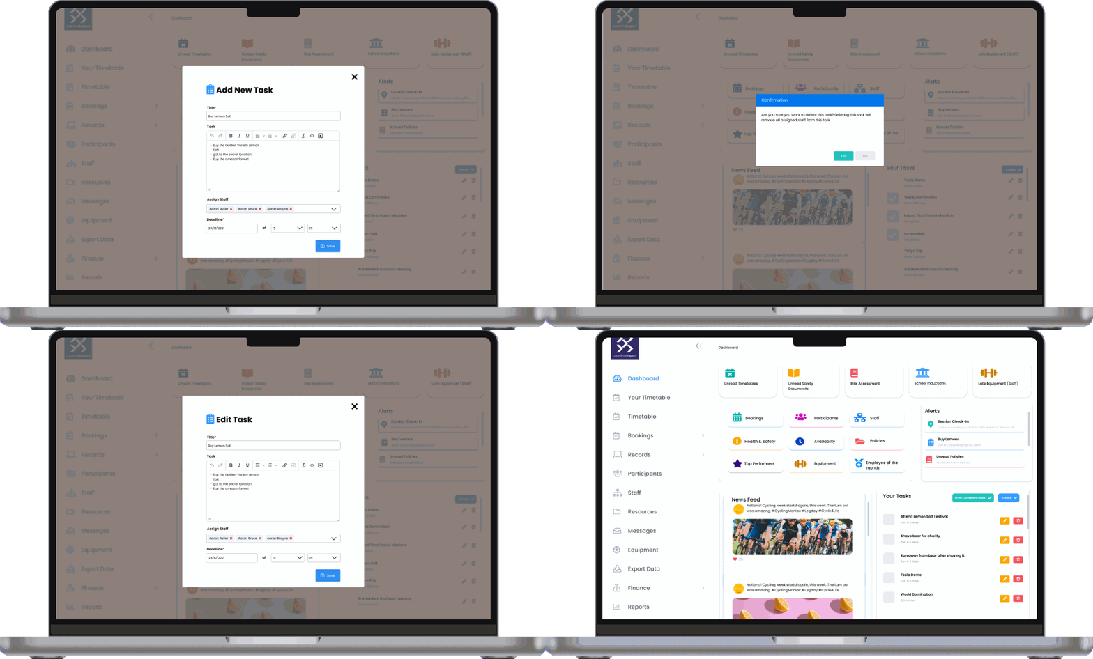
This section showcases the revamped to-do list and the streamlined process for adding and editing tasks.
To add a new task, users simply click the “Add New Task” button, which opens a user-friendly modal dialog. Here, they can effortlessly enter the task name and description. Once they've completed the details, they just click the “Add” button to save the task.
Editing an existing task is just as easy. Users can click the edit icon next to the task name, which brings up a modal dialog for modifications. They can update the task name and description, and once satisfied with their changes, they simply click “Save” to apply the updates.
Step 8
What the numbers say
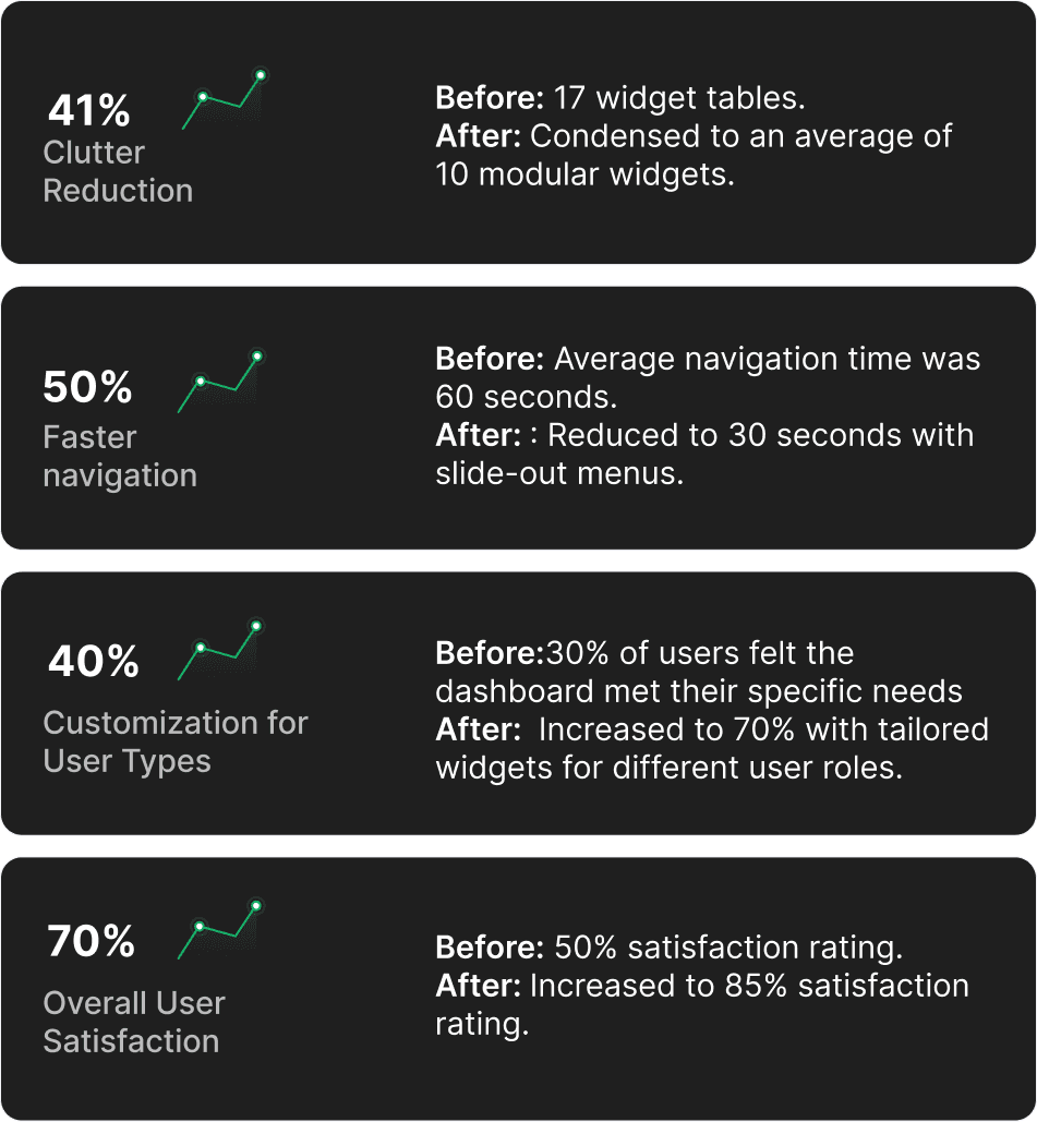
Some key metrics and figures that represent improvements after the redesign of the Coordinate Sport dashboard:
Step 9
Conclusion
The redesign of the Coordinate Sport dashboard has successfully addressed key usability issues and enhanced the overall user experience. By shifting from a cluttered layout with over 17 widget tables to a more modular and responsive design, the dashboard now better accommodates the diverse needs of its users. The implementation of slide-out menus has significantly improved navigation speed and mobile responsiveness, allowing users to access information more efficiently. Additionally, the visual updates and consistency in color schemes have created a more cohesive and intuitive interface, making the platform easier to learn and use.
